
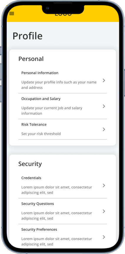
Online Access is an application designed to empower individuals to manage their own financial portfolios independently. It allows account holders to make adjustments to their accounts directly, eliminating the need to visit a local branch or consult a CPA over the phone. My responsibilities included not only the design of the Profile and Settings sections but also the information architecture. I focused on organizing the various settings into clear, understandable categories, all within a mobile-first design framework.
Online Access (OA) allows clients the ability to manage their portfolios online.
My Role
- Responsible for designing the Profile and Settings portion of Online Access
- Work with lead researcher to test various portions of Profile and Settings and utilize the research findings to recommend changes to improve the overall experience.
- Help to integrate UX into the Agile process.
- Design for all mobile breakpoints
- Work with developers to implement the design
- Ensure Accessibility
Results
- Organizing the design files and updating the design to use components increased the speed of designing allowing work to be completed fast and make changes on the fly.
- Designs were scalable lending to increase speed of change request.
- We met product launch date.
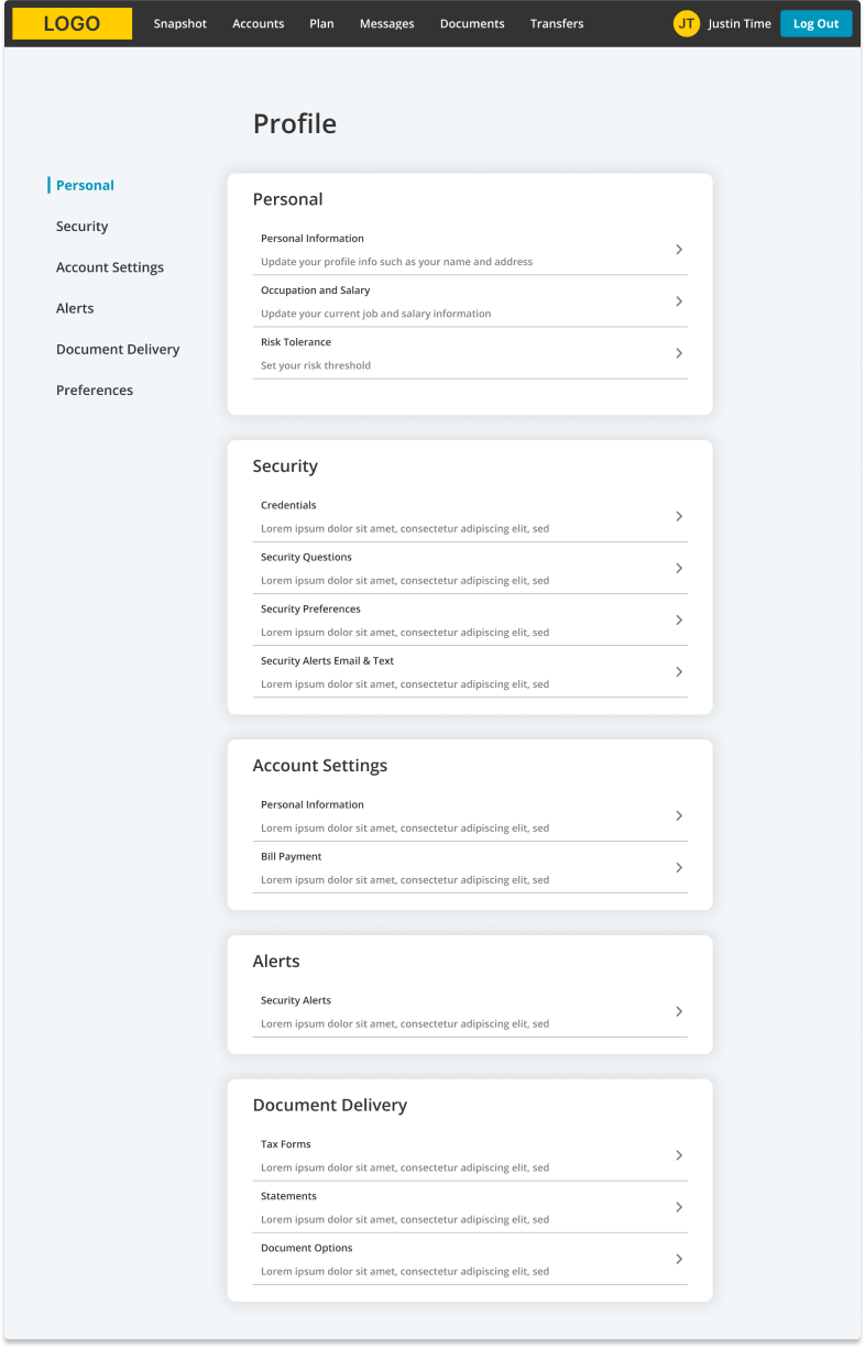
Profile & Settings Home
Online Access is geared to put people in charge of their own portfolio.
Online Access is an application geared to put people in charge of their own portfolio. Online Access gives account holders access to make elections on their accounts without having to call into a local branch and talk to a CPA.
Once users have access, they are able to login and view their portfolio and various metrics. They are also able to make adjustments to their portfolio options. Alternatively, they can contact their local branch manager and talk to a CPA on hand.
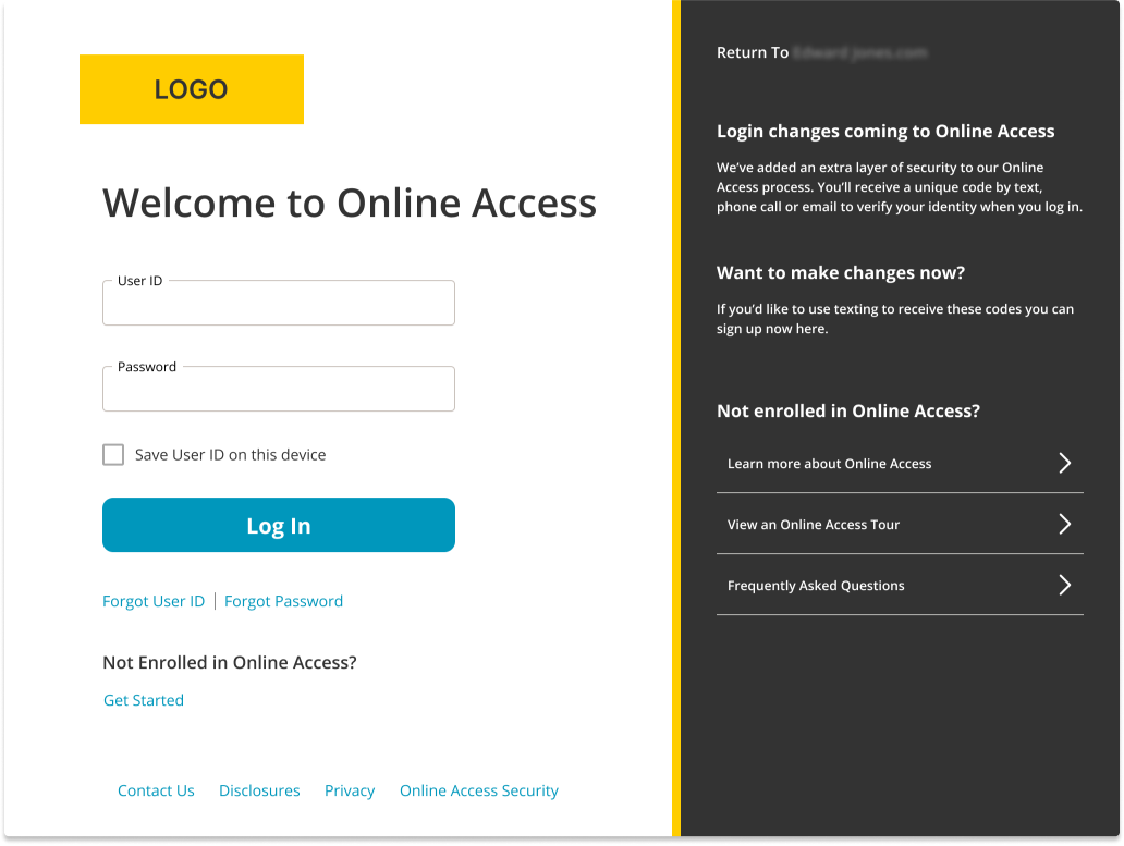
Login
Profile & Settings Redesign
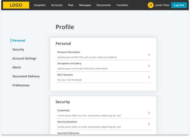
Before the redesign, the old Profile & Settings page crammed all the settings options onto a single page. This layout made it challenging for users to quickly locate the specific settings they wanted to adjust, as there was no categorization or logical grouping. The overwhelming amount of information forced users to sift through everything to find what they needed. Additionally, the use of technical jargon without accompanying explanations led to a high number of branch calls, as users struggled to understand what the settings meant.
During the redesign process, I focused on creating logical groupings for the categories, a decision supported by user research findings. Each category now features a brief description that outlines the settings found within that grouping and provides explanations for any technical terms used. This approach helps clarify the purpose and use of each setting, enhancing user understanding and navigation.
Profile & Settings Categories
User research revealed that settings across various subcategories encountered similar issues
With the settings now organized into cards grouped by related subcategories, users can more easily pinpoint the specific setting they need. User research revealed that settings across various subcategories encountered similar issues, including uncertainties about whether selections were correct and a noted absence of helpful information for making informed decisions. These concerns were specifically addressed in the redesign of the inner pages, enhancing clarity and support for users as they navigate through the options.
To address these issues, I implemented explanatory text and organized the settings into logical groups. Understanding that users typically scan from left to right and then top to bottom, I designed the settings to flow logically and progressively, building on each previous setting and incorporating progressive disclosure where necessary. Additionally, I used bold fonts and familiar form controls to help users intuitively and confidently select the appropriate settings, minimizing the fear of making incorrect choices.
Sub Pages
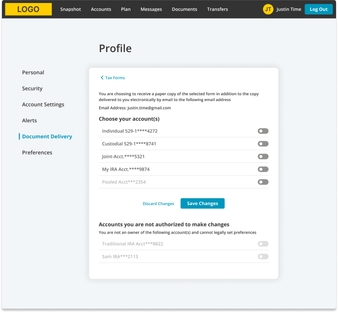
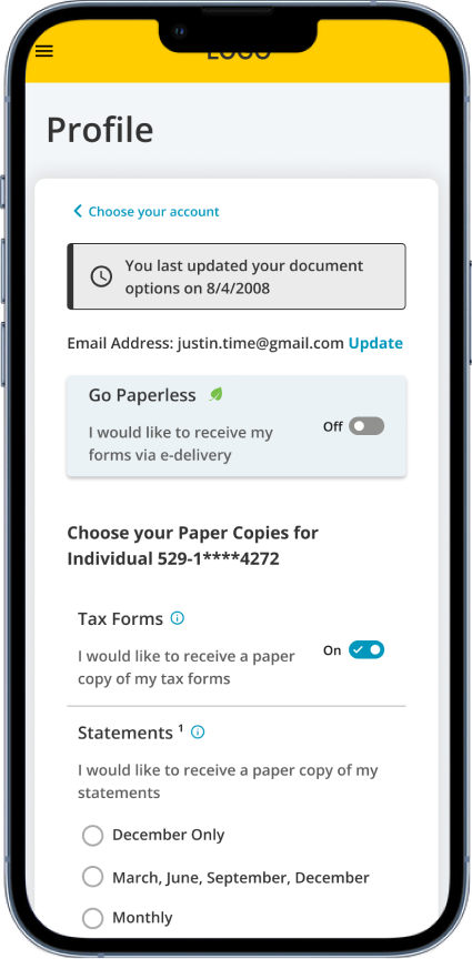
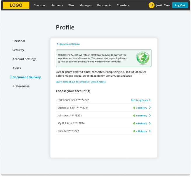
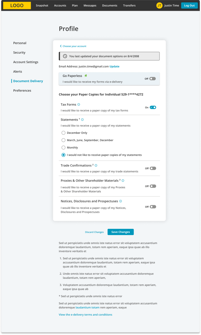
Specific Concerns around Document Options
There was a different set of concerns around the Document Options section of Online Access. Accounts were presented in a grid with account options in various columns. Each column had multiple form controls whether checkboxes or radio buttons. Users were unsure if they should make a selection in one column or multiple columns. Additionally, users were unsure how to unselect a radio option choice once selected.
To tackle these issues, I arranged the form questions vertically and incorporated progressive disclosure to manage the complexity of information presented. I also added info icons next to each setting and technical term, which provide tooltips with brief descriptions, enhancing user understanding. Additionally, I used familiar form fields that users commonly encounter in other interfaces, creating a more intuitive and user-friendly experience.
Profile & Settings > Document Options
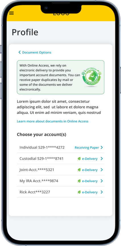
Profile & Settings > Document Options > Choose your Account
Mobile First Design
I adopted a mobile-first approach in redesigning the Profile & Settings section. Originally, the Document Options section was formatted as a table with multiple rows and columns, which posed a challenge for mobile compatibility. As many designers know, tables are notoriously difficult to adapt for mobile screens. With this in mind, I ensured that both the main Profile & Settings section and the Sub Pages were designed to be mobile-friendly from the start. This approach guided every aspect of the layout and functionality to ensure a seamless mobile experience.
By stacking all the settings, I enhanced the design’s adaptability for mobile resizing and breakdowns. Within a week of gathering all the necessary requirements, I successfully presented the design to the stakeholders in both desktop and mobile formats.
Profile Home
Choose your Account
Statements