
As the Senior UX Designer I was responsible for managing the migration from PPSE 2.0 to 3.0 system. Job duties involved combing through the outdated site and redesigning each page. Leading user research to ensure the redesign has better flow and users see all information needed to purchase products.
Parts Pro SE (PPSE) is a parts catalog for ordering parts for service customers replacing paper and PDF catalogs.
My Role
- Making sure the business has what they need from UX.
- Standardizing the teams UX process.
- Offering advice around UX best practices and dev handoff.
- Making sure all designs follow UX standards and adhere to the NAPA shared design system.
- Prioritizing stories and creating tickets as necessary.
- Leading design review meetings.
- Mentoring on how to leverage Figma to increase speed and efficiency of designs thus allowing for fast turnaround on changes requests or re-work.
Results
- Organizing the design files and updating the design to use components increased the speed of designing allowing work to be completed fast and make changes on the fly.
- Designs were scalable lending to increase speed of change request.
- We met product launch date.

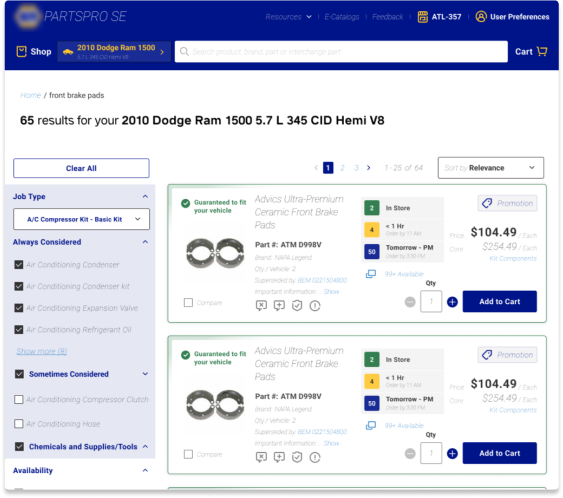
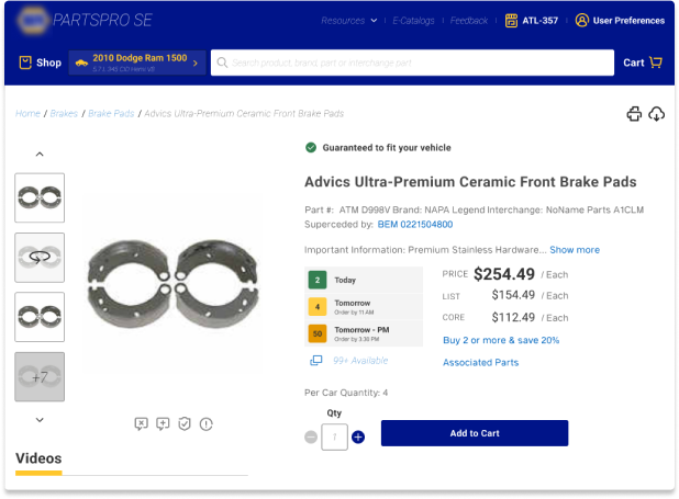
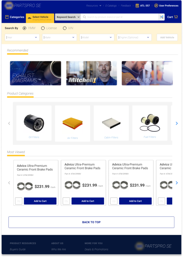
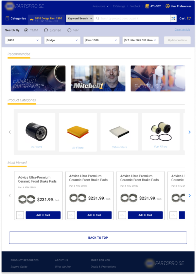
Areas that needed to be redesigned included the Home Page, Product Landing Page, and Product Details Page
While on the team I worked on various elements of the Home page experience including the Vehicle Application section, Recent Searches, and Product Categories.
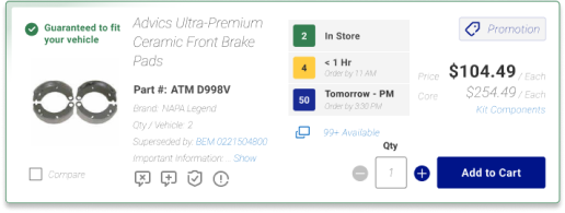
I worked with teammates to design the Product POD experience ensuring information costumers are looking for is presented in a way that is easily findable amongst the vast information on the page.
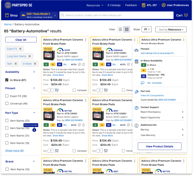
– Product Landing Page (PLP) with Product POD –
– Product Detail Page (PDP) –
Conducted Moderated User Test Sessions for PPSE Team
During the testing of PPSE I was involved in the entire process from start to finish. We had a series of moderated and unmoderated sessions. For the unmoderated test sessions we used a tool called Maze which I used to build the test users would take.
I moderated all user test sessions via a zoom call.
Lastly I worked with the team to consolidate the findings into a digestible deliverable.
After consolidating the feedback from our user testing sessions I created a future state design that best addressed our users concerns. This design was well received by the business and will be what the UX team is going to lead with towards the future testing and iterations.
Positive Reception of UX Recommendations After User Test Session
One of the highlights found in our research was users did not prefer the implementation of the vehicle selector as it did not allow the users to easily change their selected vehicle from the inner PLP and PDP pages. Users preferred a ribbon like design listing the vehicle horizontally along the top. Users preferred this band to remain on all interior pages
Removing the vehicle selector opened up avenues to re-image the product search and reclaim space for Recommended and Product Categories. This approach also opened up a different way to showcase a vehicle part fitment is complete. By completing all filter criteria (Year, Make, Model, and Engine) the system can guarantee part fitment. This is showcased by the blue ribbon vs yellow ribbon for shopping without a vehicle or partially completed vehicle
Incomplete Vehicle Added
Vehicle Complete
Additional findings from the user research session.
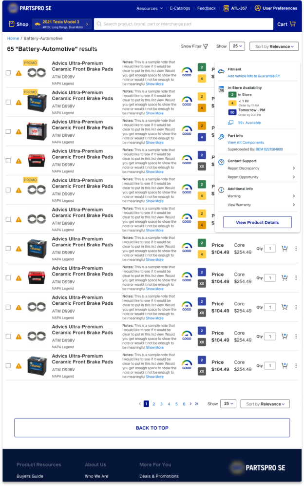
There were additional concerns around the POD on the Product Landing Page being quite large only allowing 2 and 1/2 pods to fit before the fold. Users wanted a way to see more pods on the screen at once. Additionally, users wanted a low bandwidth mode as some shops have poor internet quality.
These concerns were addressed in the fast follows mockup presented to the business. With the grid view design users can see 6 and 3/2 pods before the fold. Clicking on the kebab menu reveals additional options not easily seen or accessed via the grid pod.
Grid View
Low Bandwidth Mode
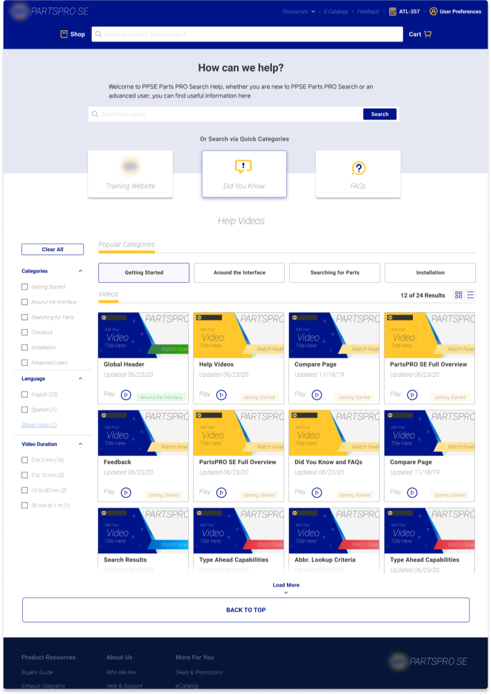
Help and Support pages updated
The Help and Support pages were re-imagined allowing for filtering options and videos to be categorized for easy access.
Help & Support Home
Multiple Team Support. Coached Team in best UX Practices
I was able to offer UX support for both PPSE and NDT teams. On both teams I was able to show how to utilize Figma to optimize design time. During this time I established myself as the go to person for all things Figma. Some of my contributions for UX best practices include:
• Introduced the use of Figma components and demonstrated how to create and make use of them.
• Instructed team on how to create variants of the components
• Helped to establish the Atomic Design principle as a baseline in creating components or other elements used in our designs
• Updated designs to utilize the shared design system